Jesse's Song
This was basically just for fun, the real piece just has flat color background, no texture.
It's some interior album art for this children's album by an independent recording artist in Nashville, TN. Visit my main blog and dig around in the recent past for more posts on the artwork for this project.
I threw a watercolor texture over it and played with the layers.
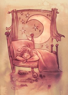 Here's what I ended up with.
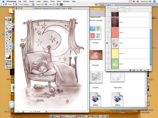
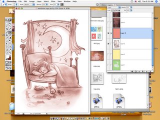
I put a layer of Color over it, and turned down the opacity just to change the color of the lines.
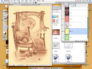

Just messing, I did another a layer of yellow to warm it up.
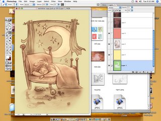
And added a layer of a green to the background, the boy and the bed erased out.
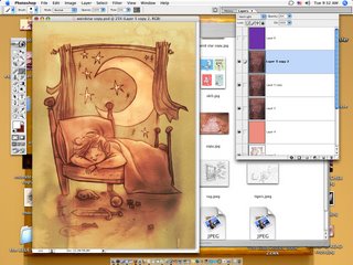
This is where it starts to look cool~ I dropped in a scanned watercolor texture I had made and copied a couple times, setting it to Hard Light. Experimentation is the key for this. It's a weird layer setting.
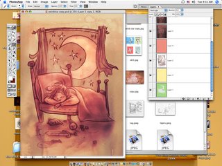
Then, just to nudge the color a bit, I dropped a layer of purple Soft Light over it all.
Pretty simple, but I think it looks cool. To me, a realistic texture and traditional feel is what gives digital work credibility.
It's some interior album art for this children's album by an independent recording artist in Nashville, TN. Visit my main blog and dig around in the recent past for more posts on the artwork for this project.
I threw a watercolor texture over it and played with the layers.
__________________________________________________
 Here's what I ended up with.
__________________________________________________

This is the orginal drawing. A lot of smudging the pencil around, so it's got some texture already. I picked out a few highlights with a layer of Screen but mostly, this is the original.

I put a layer of Color over it, and turned down the opacity just to change the color of the lines.


Just messing, I did another a layer of yellow to warm it up.

And added a layer of a green to the background, the boy and the bed erased out.

This is where it starts to look cool~ I dropped in a scanned watercolor texture I had made and copied a couple times, setting it to Hard Light. Experimentation is the key for this. It's a weird layer setting.

Then, just to nudge the color a bit, I dropped a layer of purple Soft Light over it all.
Pretty simple, but I think it looks cool. To me, a realistic texture and traditional feel is what gives digital work credibility.


15 Comments:
At 8/11/2006 5:29 PM, Tanya Nichols said…
awesome tutorial...gracias...great pic of the tinyone sleeping...
At 8/11/2006 5:46 PM, L. A. Stern said…
Cory, how did I ever miss this blog? What a treasure!! I've always worked in traditional media, but just recently bought a wacom tablet that has some abreviated "painter" and "photoshop" software on it. Thank you sooo much for this step-by-step approach. it really opens things up for me. I agree with you 100% -- realistic texture is what gives digital art credibility. That, and beautifully rendered drawings such as yours!
Thanks so much for sharing yor wealth of knowledge. I'm going to link to this page and wait with baited breath for your next installment!!!
Linda
At 8/11/2006 6:19 PM, pangolin said…
Hey its great to see the process documented.
Thankyou.
At 8/11/2006 6:50 PM, boredomsketch said…
I agree, its great to have the process documented. Great drawing as well.
She must have played all dayyy long and now its playing on her dreams :D
At 8/11/2006 10:08 PM, claudine hellmuth said…
wonderful! I loved getting to see your process!
At 8/12/2006 4:43 AM, Charlene said…
Woo.. thanks for explaining!
Nice pic too :)
At 8/12/2006 4:26 PM, Rita illustration said…
I love them all, but specially the last one, the one with stripes on it! And the background is great!
/M
At 8/12/2006 11:13 PM, murphy girl said…
sweet image!
At 8/15/2006 9:02 AM, Anonymous said…
This is really great stuff. Have you ever thought of putting up your tutorial .psd files for download? If not on here, perhaps on conceptart.org, since there are other experts there who put up their files for learning purposes. I'd be really interested in seeing them.
Anyway, you have a wonderful style. My fav tutorial so far is the bird watcher, because there was no shading in the lineart, and you did all the coloring in Photoshop. I really love that one. Thanks :)
At 8/15/2006 3:23 PM, irisz said…
i love it! i like the colours, and the style you have!
At 8/16/2006 12:30 PM, Cory Godbey said…
thanks to everybunny for the lovely words.
At 8/16/2006 2:44 PM, Michelle said…
this is precious! Thanks for sharing your process. I really like your style.
At 8/28/2006 2:16 PM, Unknown said…
hey jesse. i just found your site by doing a search for photoshop textures. i'm an art director in the gaming (not video) industry.
you should definately send me some samples to keep on file.
nice work.
very nice.
At 10/10/2006 3:20 PM, Anonymous said…
I learn so much every time I come here. I just wanted to say thank you! Working with the blending modes like this has improved my own technique significantly. You can see the results at my blog. Not much up now, but more is coming.
At 10/27/2006 4:16 AM, Anonymous said…
Hello, greetings from spain. Your work is awesome. I where looking at this last, I like too much, I would like to know if you could send me the watercolors textures that you used for the background?. It's a very good Idea, just for testing at least.
Thanks for your work.
PD: Sorry for my english.
Post a Comment
<< Home