Round 2
The city can be a jungle. Infact, if you look at the poster on the right carefully, you'll see that the zoo is missing an escaped lion.
* * *
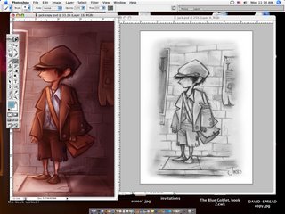
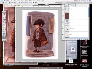
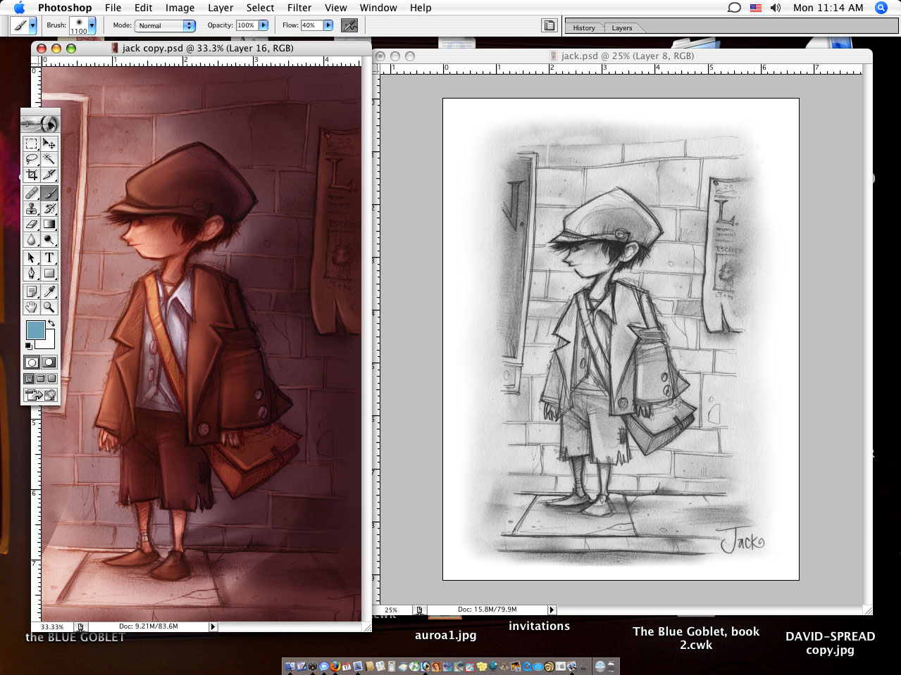
For starters, here's the finished piece next to the drawing. I don't draw on white paper. Hurts my eyes ..or whatever. I draw on magic paper. It's a kind of special ordered printmaking paper that, if the company ever quits making, more than likely I'll hang up my hat.
I'll warm the drawing over with a nice layer of soft light.
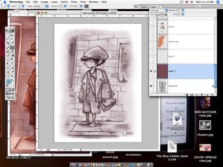
Then, after coloring the face, I'll go over with some more soft light and work with the lines til I get something I think will work.

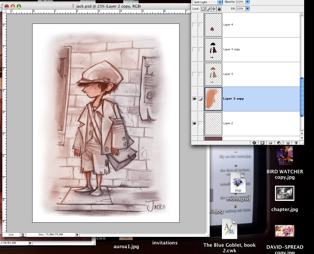
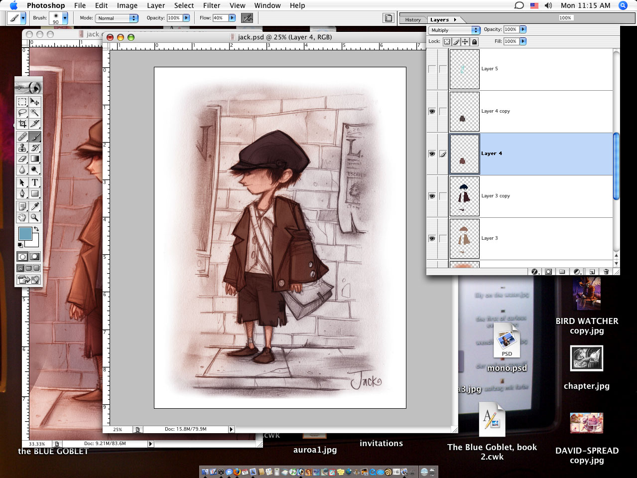
Coloring the clothes and hat. Here's a weird thing I do that when people around here ask and I try and explain it just doesn't work. I color a layer of multiply and then copy that layer. I'll take the copy and change the layer setting to soft light and then Hue/Saturation change it to a little darker and (usually) a little redder. At that point most people slowly say, "Ok. ...Why?" To me, it colors the shape and the line and I think it looks better, and warmer (or cooler in some cases) and all around good.
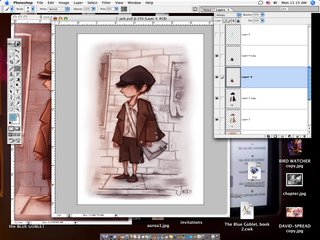
Shirt shirt... see SEE? Color the shirt blue. Copy the layer, turn it to soft light and make it a little redder (you get purple) and then the lines change color and it looks richer. I'm not nuts.
Brick work color, involves the same principles.
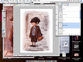
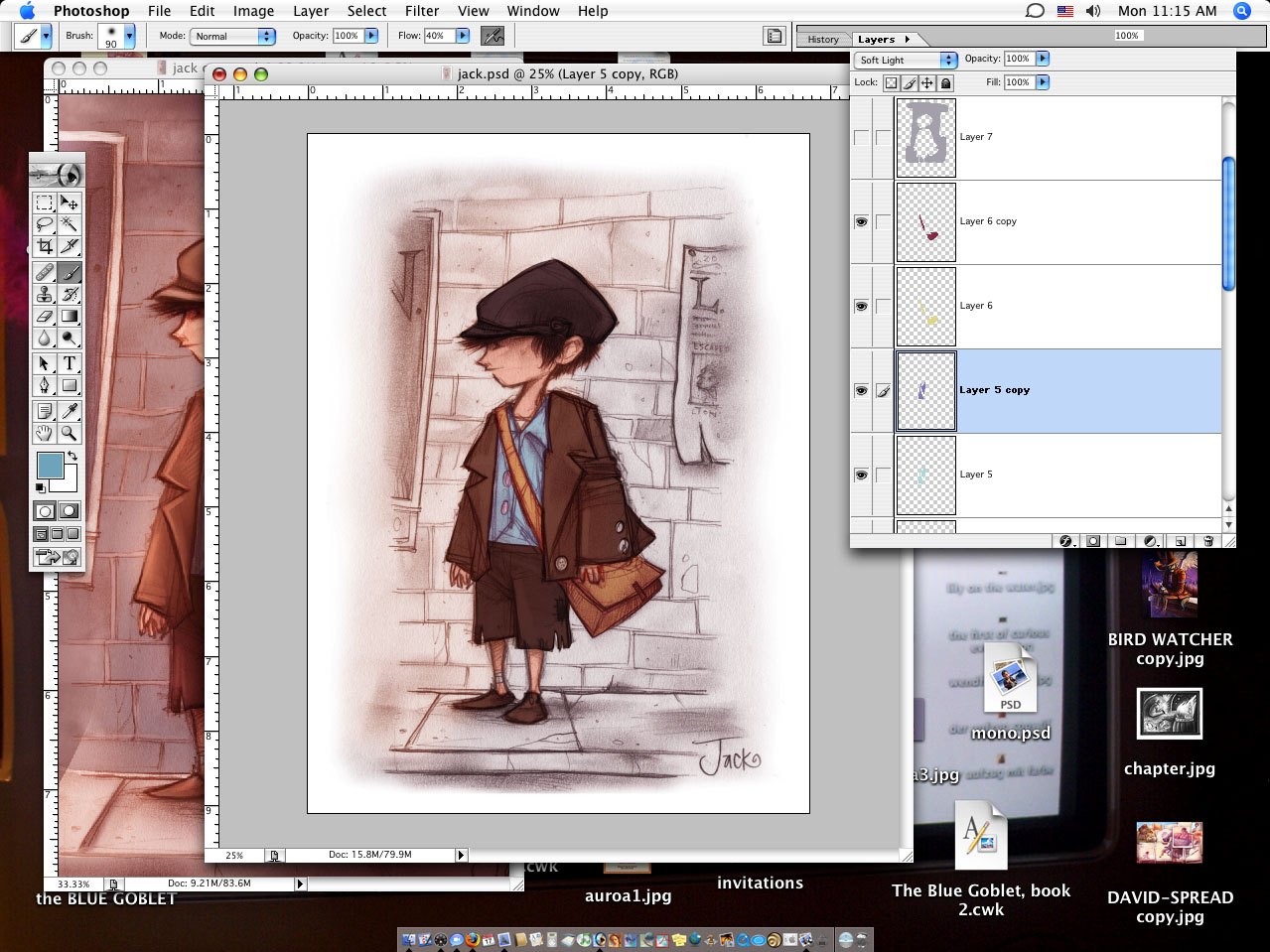
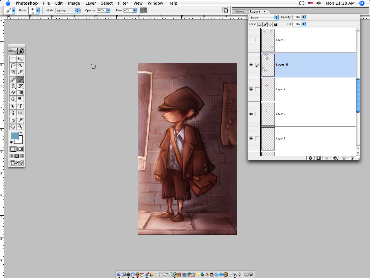
Here's the ticket. Screen. Screen is magic. Use a dark color though, it goes atomic pretty fast otherwise. While you were looking away I added a lot of shadows. Don't panic. And some more screen.
More screen...
Ok, in this one not much is changed but look at the shadows at the sections of the sidewalk. Helps to sell that there's light coming from the left.

Lighten up a few areas with more screen...

Bricks...
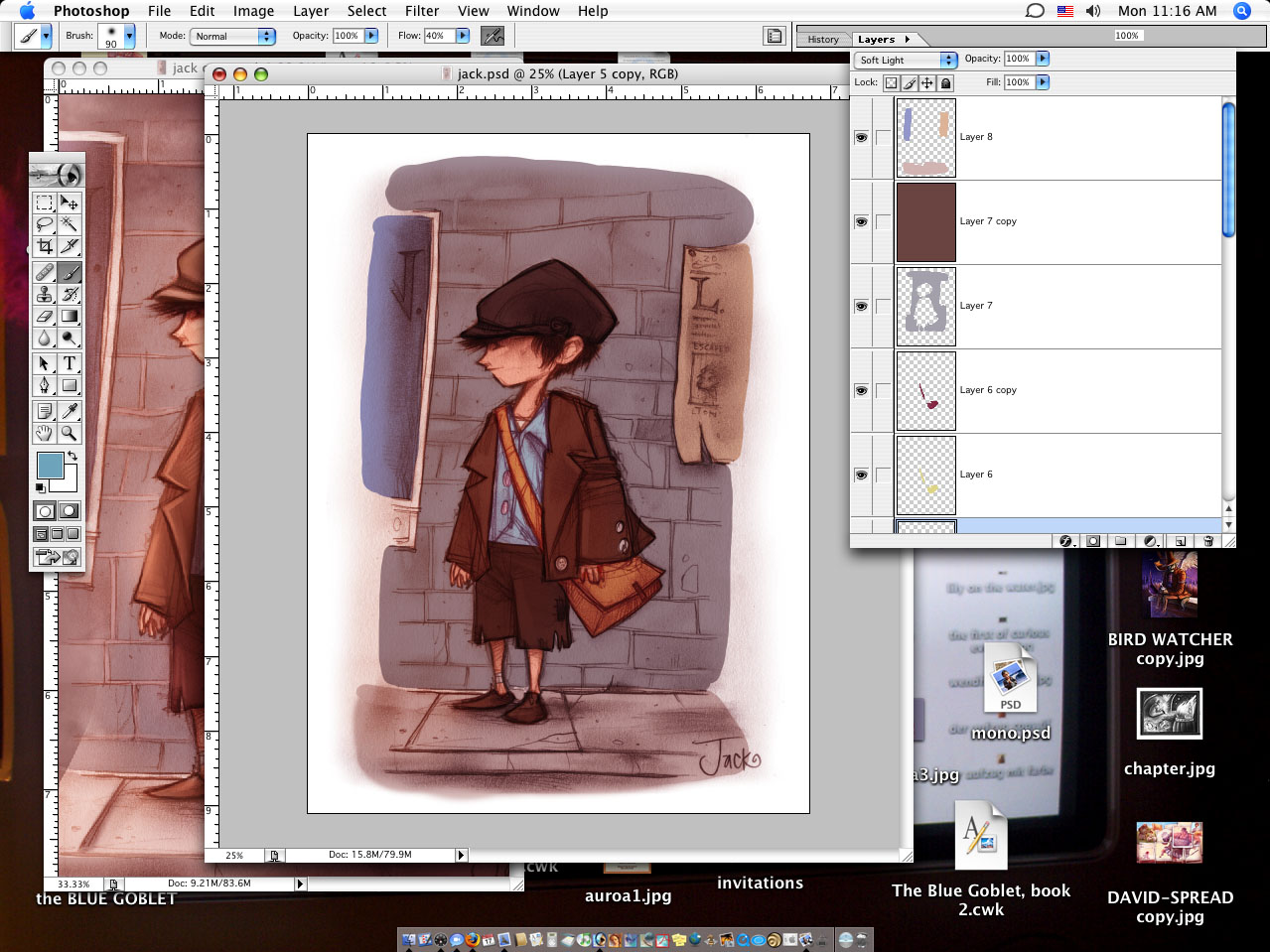
By now I've added some more shadow and a blue light on the back of the boy.

Here's a trick. At this point I'm thinking the face lines have got too washed out so I just copy them over from the orginal drawing to strengthen them up some.
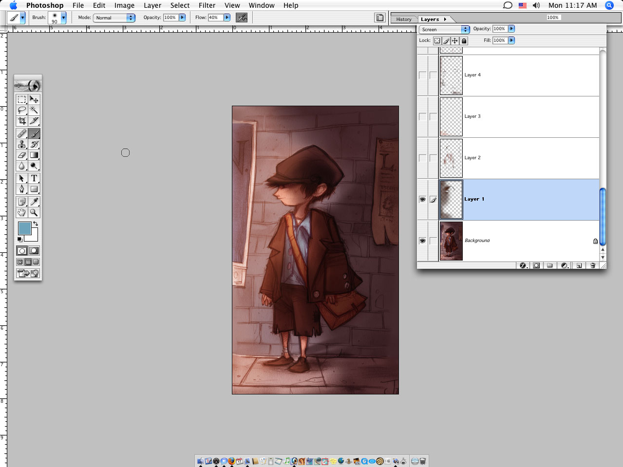
And there you go.
My Thoughts: I like this one. It wasn't super complicated and I think I did it around an hour and half to two hours, painting time. I like the light and the feel. I don't think it's as bold as it could be, or maybe it needed to be a better pose or drawing, I don't know, I just like the light. It feels smoky to me and that's what I was after so, chalk this one up as OK.
* * *
I'll warm the drawing over with a nice layer of soft light.

Then, after coloring the face, I'll go over with some more soft light and work with the lines til I get something I think will work.
Coloring the clothes and hat. Here's a weird thing I do that when people around here ask and I try and explain it just doesn't work. I color a layer of multiply and then copy that layer. I'll take the copy and change the layer setting to soft light and then Hue/Saturation change it to a little darker and (usually) a little redder. At that point most people slowly say, "Ok. ...Why?" To me, it colors the shape and the line and I think it looks better, and warmer (or cooler in some cases) and all around good.
Shirt shirt... see SEE? Color the shirt blue. Copy the layer, turn it to soft light and make it a little redder (you get purple) and then the lines change color and it looks richer. I'm not nuts.
Brick work color, involves the same principles.
Here's the ticket. Screen. Screen is magic. Use a dark color though, it goes atomic pretty fast otherwise. While you were looking away I added a lot of shadows. Don't panic. And some more screen.
More screen...

Ok, in this one not much is changed but look at the shadows at the sections of the sidewalk. Helps to sell that there's light coming from the left.

Lighten up a few areas with more screen...
Bricks...

By now I've added some more shadow and a blue light on the back of the boy.
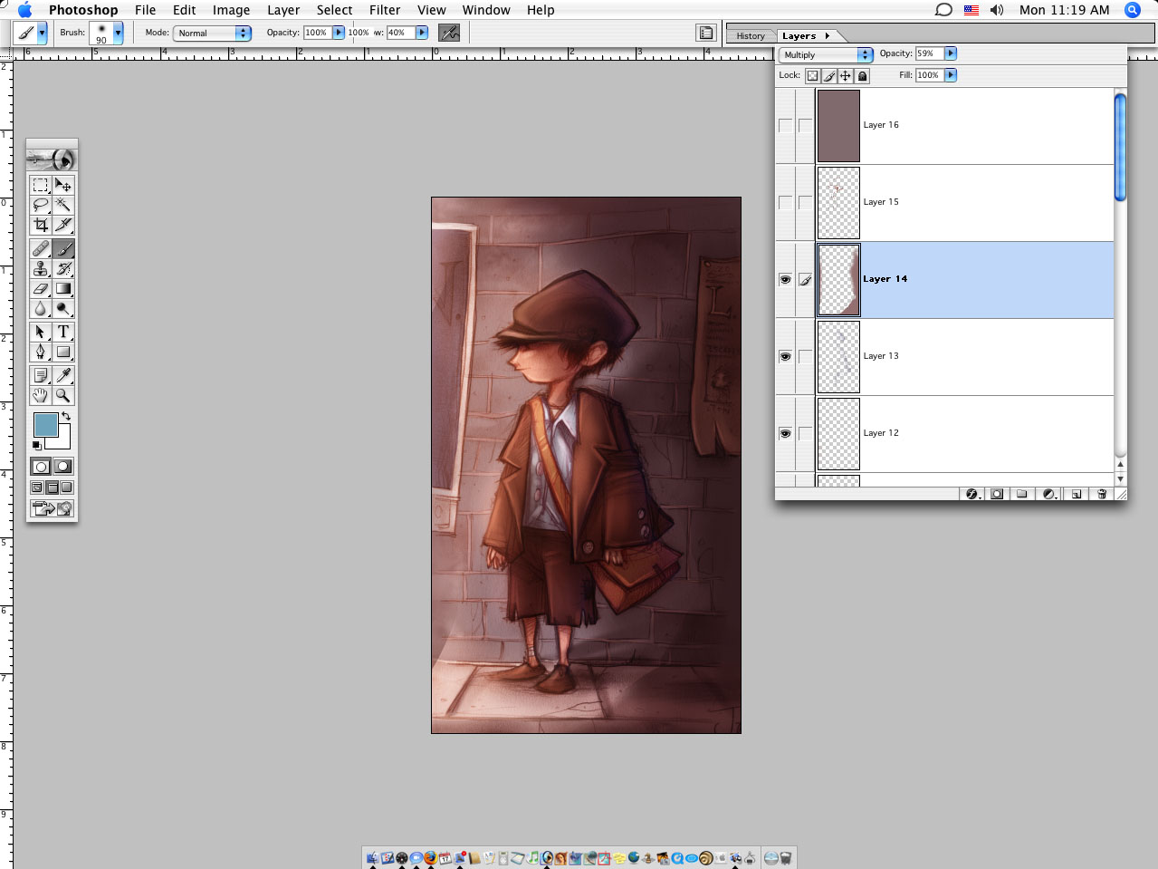
Here's a trick. At this point I'm thinking the face lines have got too washed out so I just copy them over from the orginal drawing to strengthen them up some.

And there you go.

My Thoughts: I like this one. It wasn't super complicated and I think I did it around an hour and half to two hours, painting time. I like the light and the feel. I don't think it's as bold as it could be, or maybe it needed to be a better pose or drawing, I don't know, I just like the light. It feels smoky to me and that's what I was after so, chalk this one up as OK.
posted by Cory Godbey @ 8:19 PM
![]()
![]()

15 Comments:
At 6/02/2006 11:55 AM, garth bruner said…
Chalk this one up as awesome!
Thanks for sharing your techniques! I use photoshop quite often, but the variety of layer styles just baffles me, so seeing what you do with them has taught me!
At 6/09/2006 6:27 PM, Brian Beausoleil said…
I really like your technique with photoshop. I use it quite a lot as well as Illustrator. Couldn't do without them
At 6/10/2006 6:52 PM, Anonymous said…
This is very cool!! Love that you post your techique. I am Photoshoper too! Love your style. . .lookforward to seeing more!
At 6/10/2006 10:16 PM, Powpourri said…
This is wonderful! I am so an Illustrator lady. I totally cant do this Photoshop painting, I have been trying! Anyway, you really have this down. Brandi
At 6/12/2006 7:31 PM, lil kim said…
very nice illo and always good to see how other artists work, thank you!
At 6/13/2006 6:59 PM, Anonymous said…
really stunning. as an aspiring photoshopper, i have to say i can only envy the attention to detail
Unique martini glasses
At 6/14/2006 1:15 PM, Anonymous said…
Thank you so much for taking the time to show how you do it. I learned a lot from this one and look forward to more. Your work is much appreciated!
At 6/14/2006 1:24 PM, Cory Godbey said…
hey, thank you for taking the time to thank.
At 6/15/2006 1:35 AM, Anonymous said…
impressive
At 6/15/2006 9:42 AM, s4ndm4n said…
Excellent digital-painting skills! I haven't looked over your techniques yet, but will because I am very impressed with the result! I can use PS for all but painting like this, and am more of a vector person, but would love to grow! Look forward to more!
At 6/15/2006 1:00 PM, John Daharsh said…
I'm not a Photoshopper, I love to draw and paint though. I've been googling magic paper and not getting too far. Can you point me toward a source?
At 6/15/2006 1:42 PM, Cory Godbey said…
it's just a type of printmaking paper. and i just call it magic.
http://www.graphicchemical.com/
At 6/15/2006 4:55 PM, Creative-Type Dad said…
This is GREAT stuff. Thank you!
At 6/21/2006 1:05 PM, Anonymous said…
This is fabulous! Am about to illustrate a children's book using photoshop for the first time! Does it help to sketch out a drawing with pencil shading before you scan and color ....or does just an outline work better?
At 4/05/2007 10:45 PM, Anonymous said…
Work at home opportunites For people who are smart enough to go after there own dreams
Work from home opportunites
Women who have children will love it...
Post a Comment
<< Home